How TETK’s Analysis Data Display Keeps Money in Your Pocket
- Aug 17, 2020
- Blog Post
-
 Test and Evaluation Tool Kit (TETK)
AGI’s Test & Evaluation Tool Kit (TETK) caters to all aspects and processes of a program’s test phase. From metric-conditioned route planning to post-flight verification using truth-to-track comparisons, TETK can make the life of any test engineer easier. One popular feature is the ability to visualize data from captured flight tests or events. Still, many engineers wonder, which data is good data.
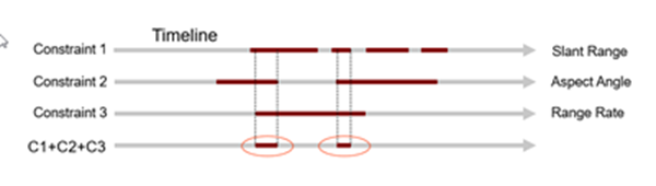
The truth is that flight test objectives and goals are not always completed the first time around. This leads to high refly rates and large, avoidable cost overruns. These missed objectives are usually a result of good data being hidden behind a variety of flight conditions that need to be met. If you find yourself wondering how to meet these conditions, I’m sad to tell you that I don’t have a clear answer.
I do, however, have a TETK tool that may help!
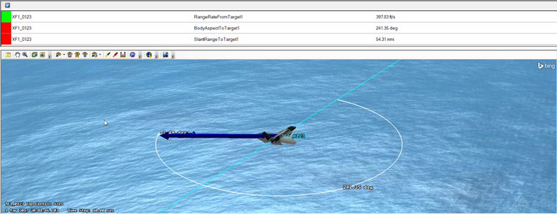
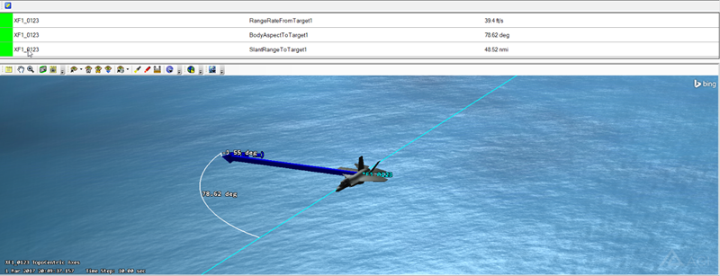
Many TETK users have dabbled with the Flight Analysis Tool’s Data Displays. They are, after all, handy tools for dynamically visualizing your data metrics within the 3D Graphics Window. But you may be surprised to learn that there is another data display within TETK: the Analysis Data Display (ADD). You can find the Analysis Data Display on TETK’s toolbar right next to the Custom Workflows icon. The ADD enables you to show time-varying metrics from your data files in a separate pop-up display. You can move this display or embed it anywhere in the user interface, freeing up the visual space within your 3D Graphics Window. Now, to meet those flight conditions!
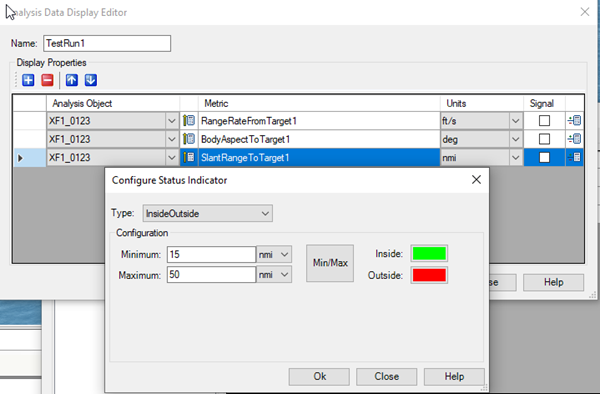
The ADD can create In/Out boundaries based on multiple metric conditions that you control. These conditions are visualized with color coding: green when you’re in spec, red when you’re out of spec. While your accounting and engineering departments may not collaborate often, they should both appreciate the extra green!
Author

Test and Evaluation Tool Kit (TETK)
Improve the efficiency and effectiveness of test and evaluation activities.